50+ Top Website Popup Examples [Templates Available]

![52 Top Website Popup Examples [Templates Available]](https://framerusercontent.com/images/ivVBrImJzTtu2LnDqpWituQOL8E.webp?width=1920&height=540)
Summarize

Chat GPT

Perplexity

Gemini

Claude
Website popups are often misunderstood. In most cases, people hate not them, but the timing. See it for yourself: one popup interrupts you before you’ve even read a sentence on a website; the other popup shows up with a 15% discount when you’re not sure about buying and then moves to abandon your cart. In the first case, it’s annoying, and in the second, it’s a conversion-focused solution.
Our analysis of 779M impressions reveals that with optimized website popups, you can recover 20% of your revenue loss and enjoy a solid 43.1% click-through rate (CTR). This guide reveals the exact strategies, metrics, and more than 52 popup examples used by global companies to convert browsers into loyal customers.
What is a website popup?
A website popup (also a widget or modal) is a window that appears on top of your website, temporarily covering the primary content. A popup usually contains useful information or an offer. Unlike other website elements that permanently live on a page, a popup is behavior-driven.
Why website popups are effective for boosting sales
Website popups are a great way to increase your revenue as they are designed to grab people's attention and prompt them to act. The key to success relies on five factors:
Behavior-based timing. Popups work because they are reactive. Exit-intent triggers catch visitors right before they leave.
FOMO and urgency. Limited-time deals make visitors think and make decisions more quickly. Our stats show a 15% uplift in engagement with urgent popups like Flash Sales.
Lead generation. Incentives turn visitors into email or SMS subscribers.
AOV growth. Upsell and cross-sell offers can act as a virtual sales assistant and increase average order value.
Revenue recovery. Cart reminders help win back sales that would otherwise be lost.
Website popup conversion benchmarks for 2026
All popups perform differently depending on the industry. We analyzed 779 million impressions to establish the 2026 performance standards. Below, we’ve broken down the averages versus the high performers. Use this stable to benchmark your current performance against industry averages and the elite top 10%.
Website popup conversion benchmarks by category and industry | |||
Popup category | Industry avg. | Top 10% Performance | Winning strategy |
Gamified (All) | 9.18% CR | 26.41% CR | Spin-the-Wheel + Single CTA. |
E-commerce (Signup) | 4.72% CR | 41.0% CR | Gamification + Percent-off discount. |
E-commerce (Promo) | 8.95% CTR | 43.1% CTR | Minimalist popup + Clear value prop. |
SaaS (Engagement) | 4.91% CTR | 20.5% CTR | Functional visuals (UI) + Professional tone. |
Food & Drinks | 6.75% CR | 30.5% CR | High-contrast product photography. |
Education | 4.19% CR | 11.6% CR | Mentor-like tone + Left-aligned text. |
Travel & Tourism | 2.58% CR | 13.98% CR | Non-discount “soft value” (Guides). |
20 Types of high-converting popups on websites (+ examples)
We’ve scoured the internet for the best website popup design examples in their natural habitat. We’ll analyze the design of each website popup and detail how these companies seamlessly integrate them into their overall user experience.
To help you navigate this list, we’ve categorized them by their primary business objective.
Category A. Maximize revenue
Use cases: Grow sales, increase AOV, leverage seasonal shopping sprees.
1. Seasonal/Event-based website popups | Claspo
Shoppers seek relevance. Our Halloween campaign features a dark and scary visual element that immerses consumers in the season. Additionally, we match the color of the CTA with the color scheme used by the brand in order to build trust.
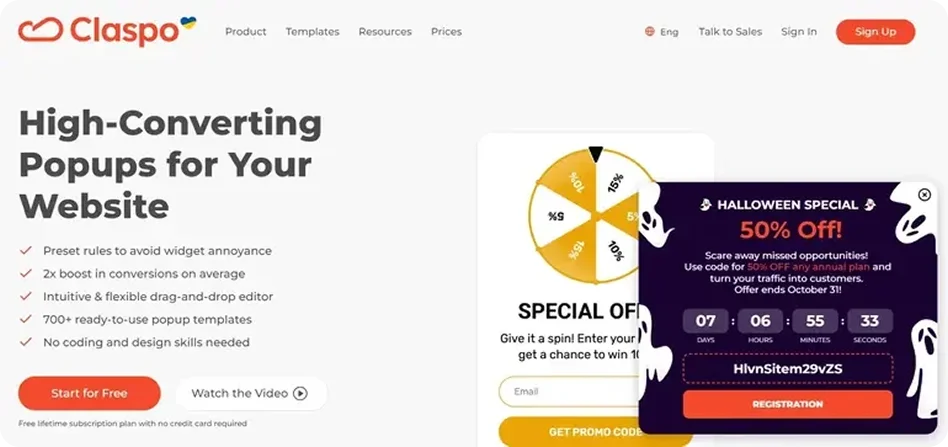
Expert Insight: The countdown timer nudges urgency. According to our benchmarks, BFCM and seasonal popups see the highest CTR (up to 6.61%) because the limited-time offer is authentic.
2. Promote special offers or discounts | Glossier
The strategy adopted by Glossier focuses on millennials and Gen Z. They present a promotional discount as an act of self-care. Instead of making the sale feel materialistic, “you deserve it” emphasizes the emotional side of purchasing.
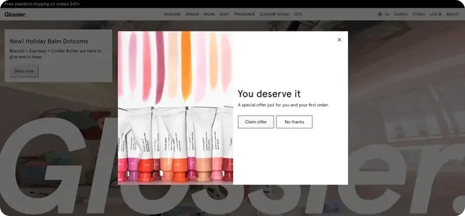
Why this works: By providing such a discount, Glossier addresses purchase barriers. In some cases, people might hesitate when purchasing products online from a brand that they have not used before. The discount helps to overcome these barriers since consumers pay less than usual.
3. Offer free shipping | Skinny Mixes
Shipping costs are the #1 reason for cart abandonment. Skinny Mixes addresses this upfront for new visitors, offering free shipping on orders over $30 in exchange for an email.
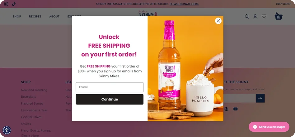
What we like: The high-quality product imagery paired with a simple form makes the value proposition impossible to miss.
4. Collect pre-orders | Burrow
Luxury brands like Burrow use exclusivity to drive action. Their Black Friday popup offers early access and a 10% discount, making the user feel like a VIP.
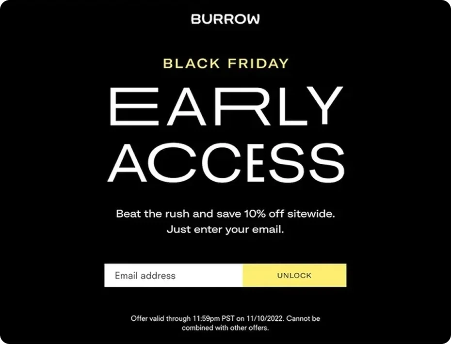
Pro tip: Use a clear deadline. It adds a layer of “act now” without feeling pushy.
5. Promote limited-time offers | Indestructible Shoes
In Indestructible Shoes' case, a prominent countdown timer turns new visitors into immediate customers. The phrase “Your feet deserve the best” in the headline makes the brand sound like a partner in improving your comfort.
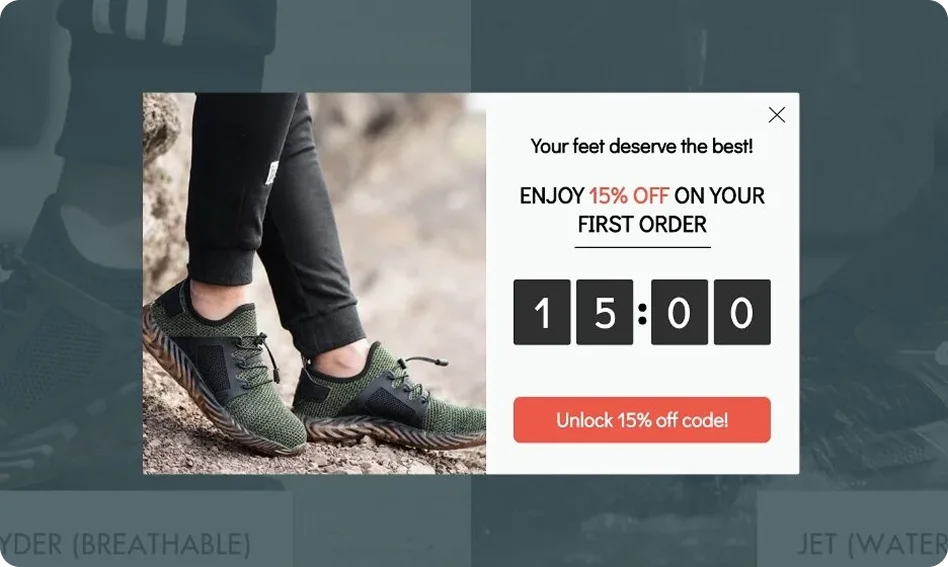
A 15-minute countdown works great to increase the urgency level, resulting in a 5.72% CTR. While effective for quick impulse buys, our data suggests being careful with such short windows for high-consideration products like footwear.
What we like: The thoughtful language and strong visual timer make this website popup effective and engaging, pushing new visitors to act quickly while still feeling valued.
Category B. Lead generation & nurturing
Use case: Grow email list for long-term marketing.
6. Branded lead capture website popups | MOO
MOO injects personality into lead capture popups by branding their email as the "MOOsletter." This small detail reinforces brand identity.
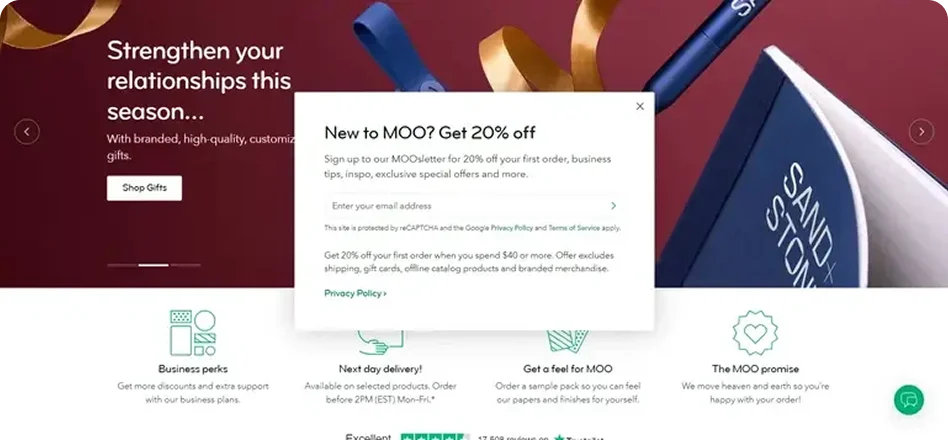
Pro tip: They use a two-step confirmation process. This guarantees both the validity of the email address and the quality of the lead obtained from the email list – crucial for proper CRM metrics.
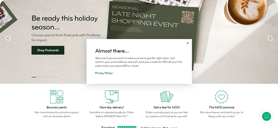
What we like: MOO's popup banner on the website is a great example of how proper copy and a good lead generation strategy can make someone feel welcomed and get a high-quality customer in return.
7. Promote lead magnet | CoSchedule
CoSchedule uses a Sticky Bar at the bottom of blog posts. It doesn't obstruct viewing the content of the page, but instead provides something of value: a marketing calendar for free.
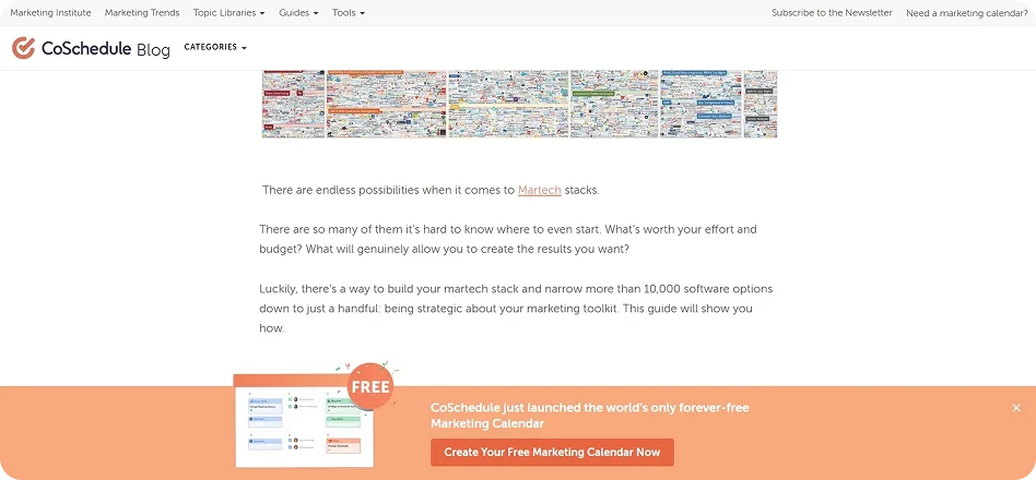
What we like: This format fits content-rich websites perfectly and allows keeping the trust level of visitors high at the same time.
8. Invite to webinar | Virtuance
Virtuance uses a Lightbox effect to dim the background, focusing 100% of the attention on the webinar details.
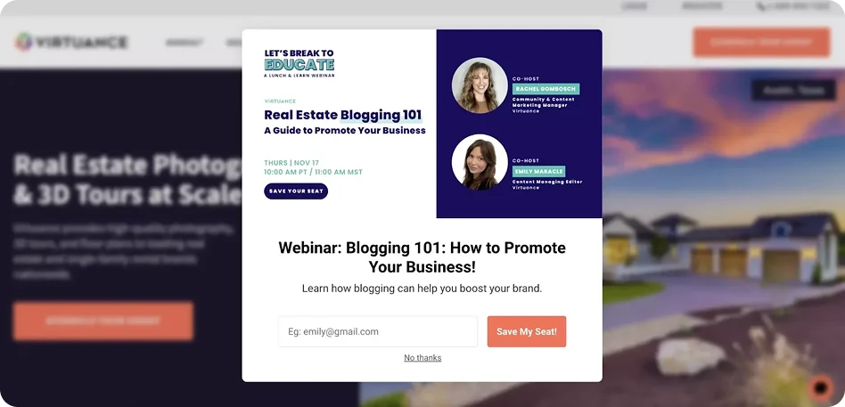
Why it works: They use a single field for registration. In B2B, reducing friction is key to getting busy professionals to sign up.
9. Collect giveaway entries | Omigo
Omigo offers a $500 gift voucher. To balance "giving space" with "getting the lead," they use a 10-second time delay.
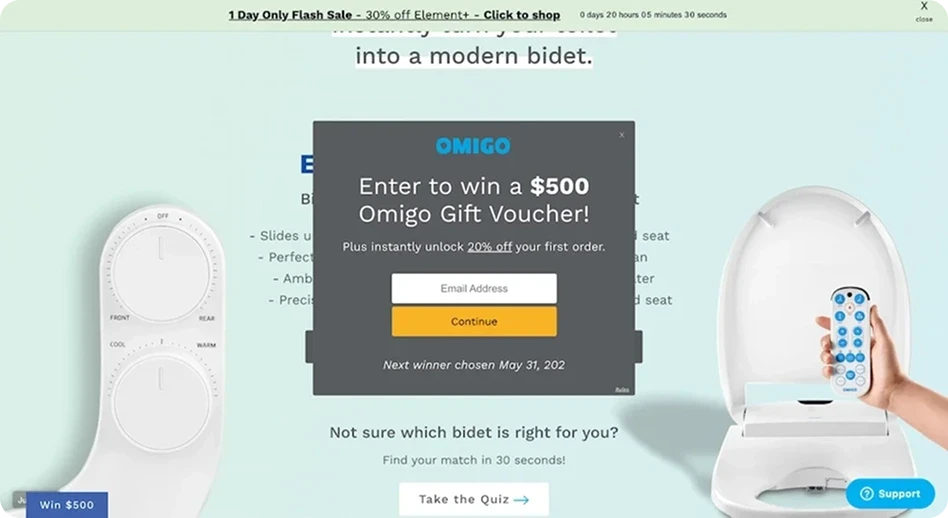
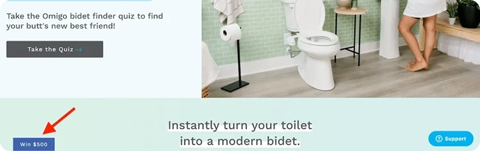
For those who aren’t ready to make a decision right away, Omigo ensures the popup remains accessible by placing a teaser in the bottom left corner. This way, it will be easier for visitors to come back to the deal when they’re ready.
10. Welcome user | Flaus
Flaus adds a personal touch by including an image of the founder and promising tips from the founder upon signup.
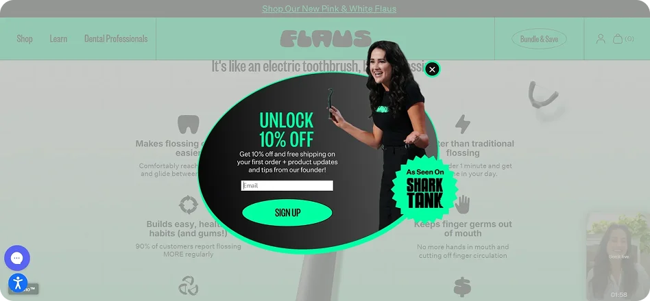
What we like: The combination of a warm welcome, strong incentives, and personalized content makes this popup highly effective. The use of the founder’s picture helps build credibility, whereas mentioning the TV show instantly builds trust and raises brand reputation. As a result, you create an attractive offer that visitors can’t help but click.
11. Subscribe to newsletter | Copyhackers
Once you land on their homepage, the floating bar right away guarantees to teach you both basic and advanced copywriting techniques that you need. This one is direct and clear.
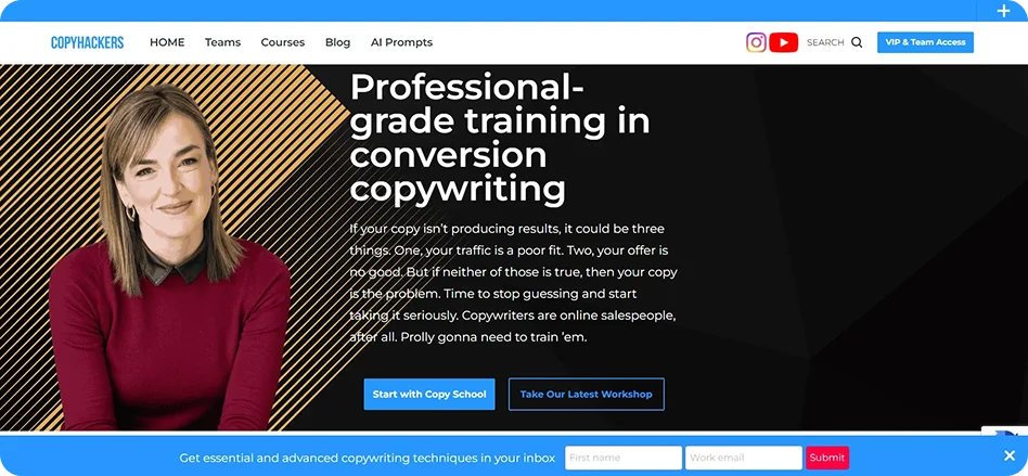
What we like: This one ranks among our favorites. Copyhackers’ floating bar combines expertly written copy and a user-friendly format to capture attention and encourage sign-ups in a way that feels natural and valuable.
12. Offer product demo | Drip
You can build a funnel using a website popup and direct your visitors to the landing page. Take Drip, for example. They use a floating bar to announce a special offer dedicated to Black Friday and Cyber Monday.
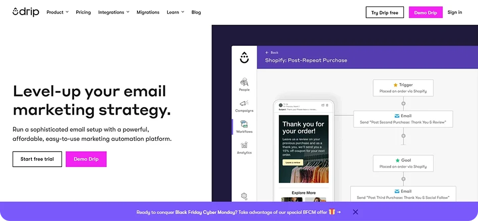
The floating bar directs users to a special landing page for demonstrations or walk-throughs.
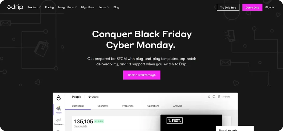
Upon clicking the “Book a walkthrough” link, you get redirected to the request for a demo page.
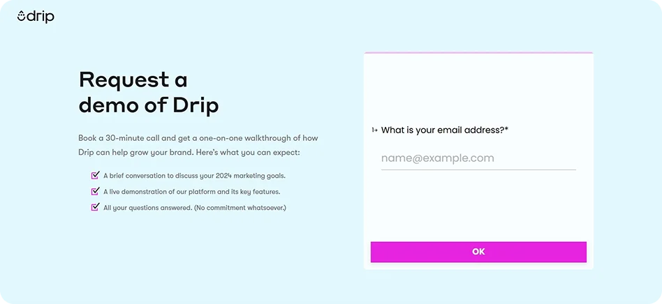
Why it works: The offer is placed in view but does not hinder the technical document or blog post the user originally sought out.
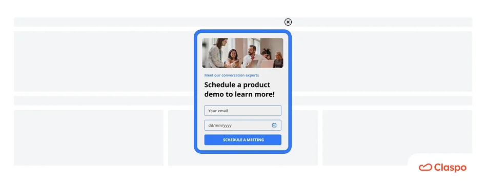
While popups for demo requests might not be as common as other types, we have templates you can use. Like this one:
Category C. Retention & recovery
Use cases: Prevent user churn, recover abandoned carts, and collect feedback.
13. Prevent exit-intent | MOO
When a user tries to leave the design editor, MOO uses a witty message: “Then we can remember the good times we shared together.”
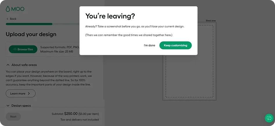
Why it works: It doesn't rely on a discount. It relies on a human connection and a humorous warning that the user might lose their hard work.
14. Prevent cart abandonment | Rothy’s
Rothy’s catches users on their way out with a specific dollar-off offer. The headline — “Your cart qualifies for $20 off” — immediately grabs attention and makes users feel like they’re getting an exclusive offer.
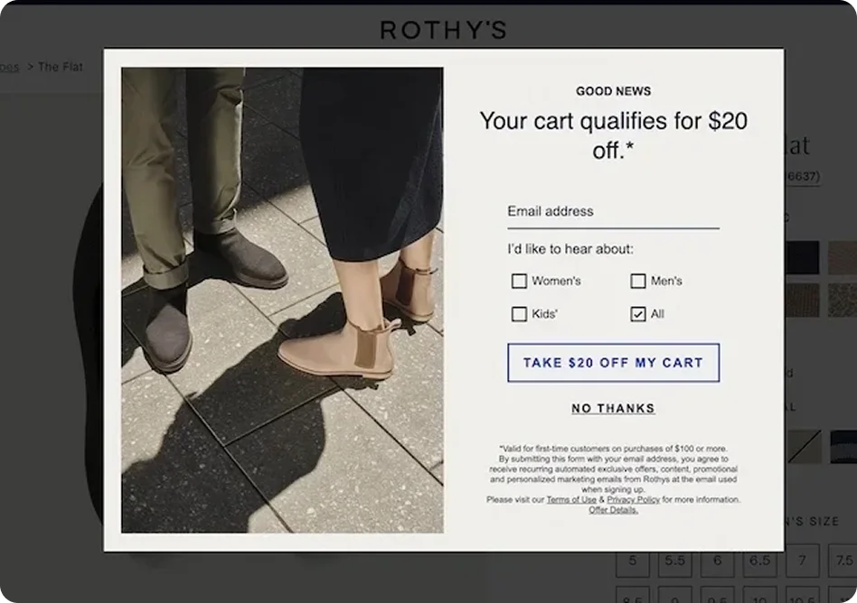
What we like: They include “No thanks” as a choice. Giving users the freedom to say no actually makes the “Yes” feel more voluntary and less forced.
15. Cross-sell recommendations | Lammle’s Western Wear
This website popup triggers on exit intent but offers Product Recommendations. It encourages the user to keep browsing rather than just leaving the site.
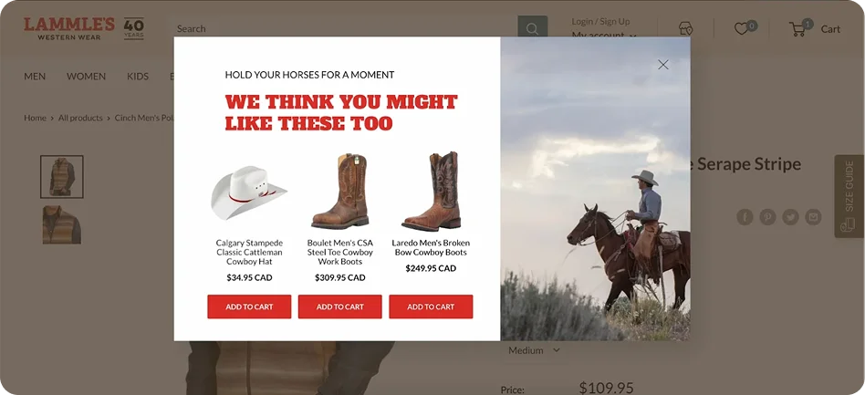
Phrase to steal: “Hold your horses for a moment”. The fact that they match the copy to the brand’s western niche builds immense brand personality.
16. Measure Net Promoter Score (NPS) | MailTag
Feedback popups on your site don't convert to sales immediately, but they are vital for expertise and trust. According to our data, feedback popups in the SaaS industry achieve a 5.28% click rate — the highest among other goals. MailTag keeps it minimalist with a simple rating system.
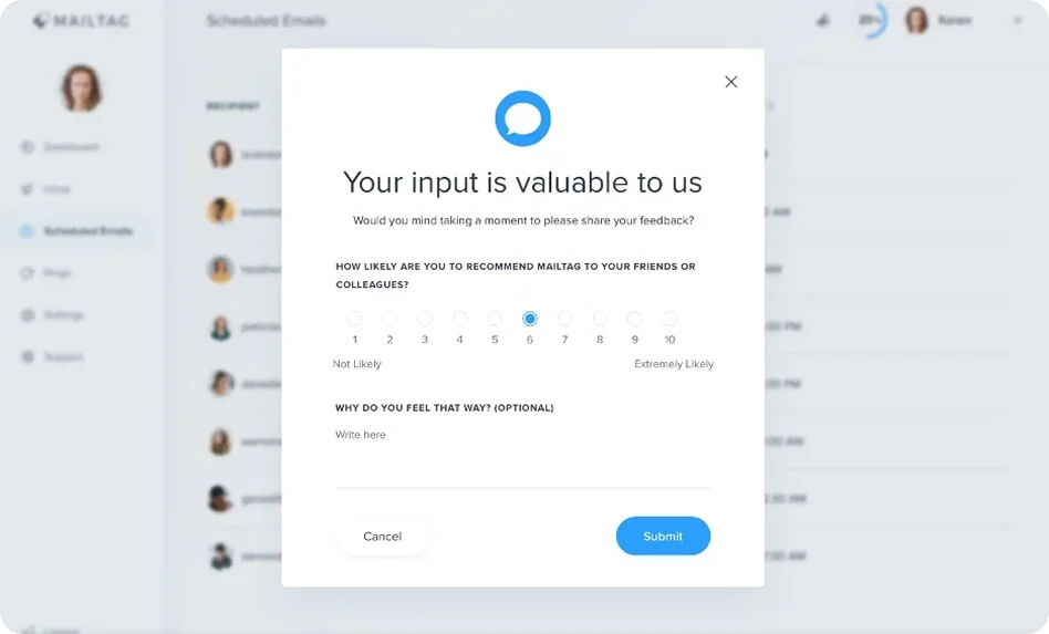
UX tip: Minimalist design drives higher engagement for surveys because it feels like it will only take 5 seconds. In fact, 42% of top performers maintain an informative and professional tone.
Category D. Engagement & Gamification
Use case: Increase sales with interactive experiences.
17. Spin to win | Blue Apron
Blue Apron uses a “Wheel of Fortune” to trigger a dopamine release. This approach keeps the user on the page because the unpredictability of the reward is appealing.
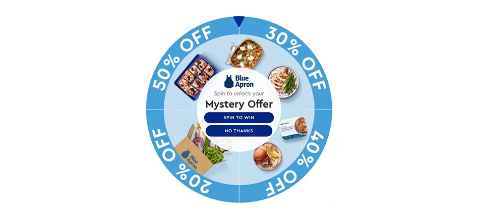
The timing of the discount's announcement creates instant satisfaction that correlates with the basic human drive to receive immediate benefits.
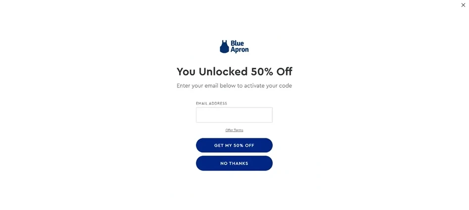
Moreover, the popup requests your email address to claim the discount. Once users make a small commitment by providing their contact information, they are psychologically more likely to follow through with a larger action, such as completing their purchase.
Data insight: Our benchmarks show that Gamified website popups can reach up to 26% CR. It turns the act of giving an email into a win for the customer.
18. Display social proof | Urban Outfitters
Urban Outfitters uses a small badge in the corner: “49 people recently purchased this.” The message “It’s selling fast” creates a sense of urgency, which implies that the user will be left behind if they do not act immediately. The use of social proof combined with a sense of urgency is very likely to compel browsers to buy.
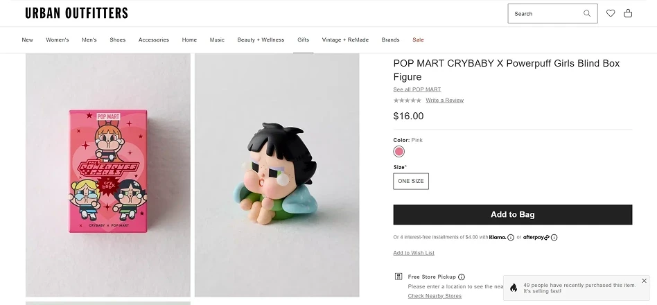
What we like: The use of informational social influence. If 49 other people bought it, the user feels safer making the same choice.
19. Redirect to another page | Sephora Australia
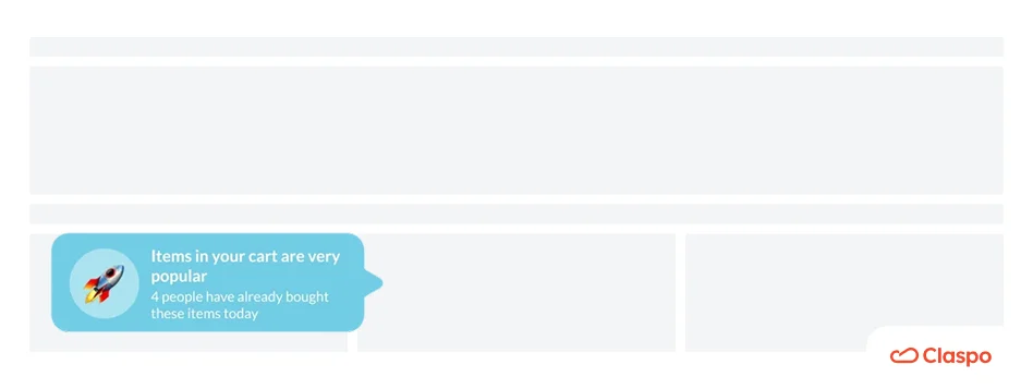
This is a good case study of how Sephora uses a popup message to win over potential customers who have just arrived on their website. The message offers a special discount to first-time buyers.
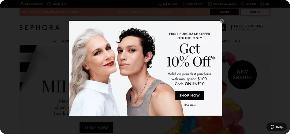
Instead of just a discount, Sephora’s website popup acts as a roadmap, redirecting users to a bestsellers page after they claim their discount.
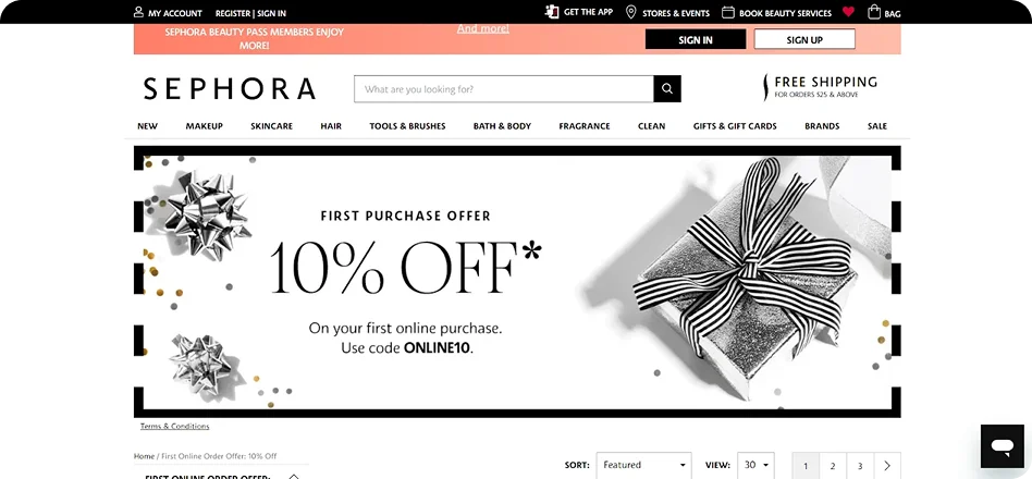
What we like: How the popup guides the user from the entry phase straight to the purchase phase.
20. Scratch card | Huron
At first glance, it’s just a clean, full-screen popup from Huron — but the scratch-to-win interaction changes everything. Paired with bold product imagery and a simple “mystery gift” hook, it turns a standard welcome message into a quick, engaging experience.
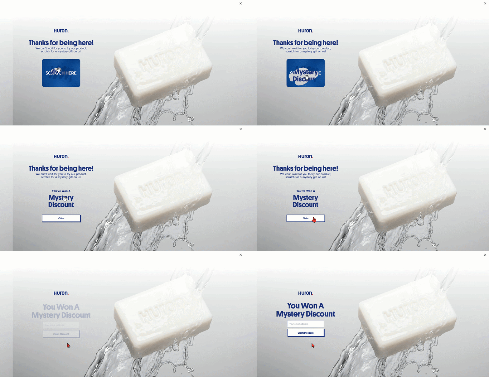
What we like: The combo of a trending full-screen layout with a gamified email collection tactic.
High-performing templates to build your strategy
Design and copy get people to look, but logic and layout get them to click. Below is a selection of Claspo’s most successful templates, mapped to the benchmarks and psychological triggers we’ve discussed.
1. Sales conversion website popups
Target benchmark: 8-12% cart recovery / 43% promo CTR.
The inline product slider
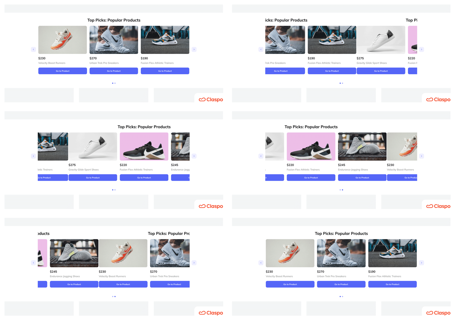
Unlike intrusive website popup windows, this integrates naturally into your page layout. It’s ideal for shopping momentum — showing related products while the user is actively browsing.
The lightbox with animated buttons
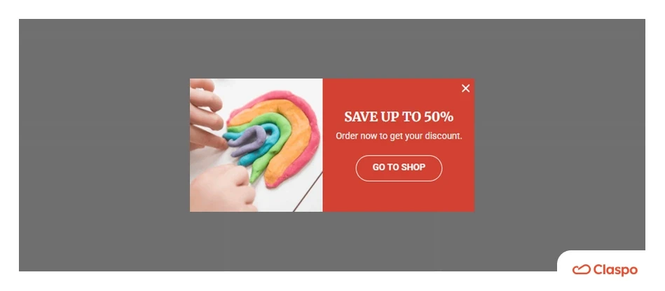
We use a “blinking” button effect here because animated and high-contrast CTA buttons can boost conversions.
The flash sale timer
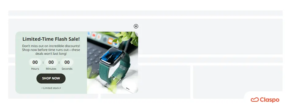
This template adds real urgency. Our benchmarks show that BFCM-style urgency drives a 1.06% subscription rate — the highest of any retail season.
The popups to increase AOV
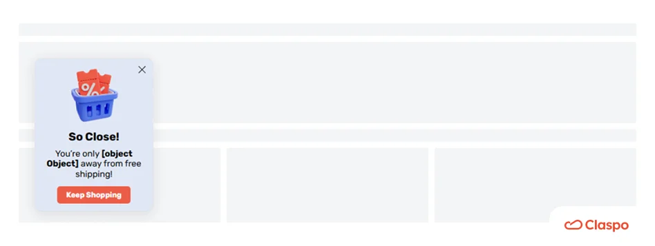
Pair sales with a "Buy More, Save More" bundle to increase Average Order Value (AOV). In ecommerce, cross-sell and upsell popups can achieve a 5.41% CTR, as seen in our benchmarks.
2. Email subscription website popups
Target benchmark: 3-5% industry avg / 9% Gamified avg.
There are many ways you can use a popup on a website to build your email list:
Use lead magnet templates to offer e-books, guides, etc.
Run giveaways
Invite visitors to subscribe to your newsletter
Run webinars
Do personalization quizzes
Offer gifts for a subscription or exclusive perks
Let’s pick apart some website popup types examples we find worth a close inspection:
Video-embedded lightbox
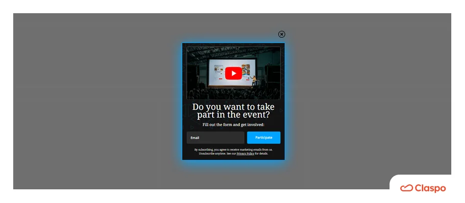
Perfect for webinars or complex SaaS products. It allows users to watch a “teaser” directly in the popup, reducing friction and building trust before they register.
The birthday reward website popup
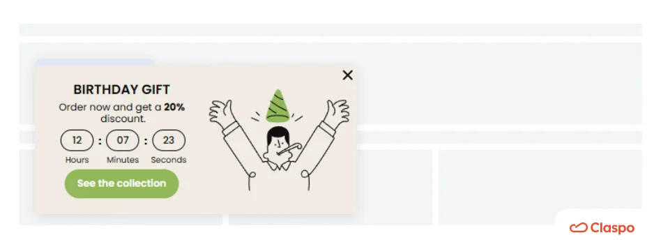
Marketing that targets birthdays is one of the most effective aces up your sleeve. If you’re a merchant running an ecommerce website, offer your visitors a birthday reward instead of a discount. They will see the gift as an act of kindness, not a marketing strategy. If you get creative, you can sell more products to them. Give a gift on their birthdays with every product they buy.
The lead magnet (style guide/ebook) popup
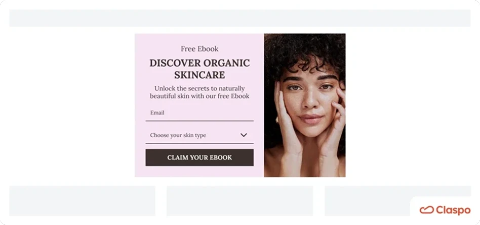
Downloadable materials address a specific need immediately. In B2B, providing a tangible resource in exchange for an email is the fastest way to establish your expertise.
3. Gamification website popups
Target benchmark: 9.18% avg / 26.41% top performers.
Interactive mechanics turn friction into curiosity. If you choose a template just because it looks cool, you're hitting the performance floor. High-converting gamified popups succeed because they match the user’s psychological state and your specific business goal.
Spin-the-wheel
The undisputed leader for first-touch engagement. It’s universally recognized, so users spin right away without any instructions.
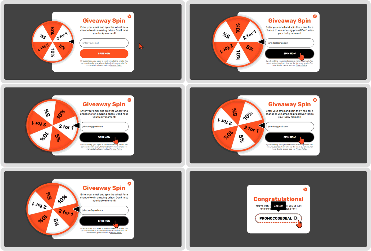
Why it wins: Triggers a micro-dopamine spike the second the wheel moves.
Best for: Cold traffic, welcome flows, and major sales like BFCM.
Scratch card
Our highest overall performer (11.29% CR). Humans hate unfinished business; a covered code creates a psychological itch that the user must scratch to resolve.
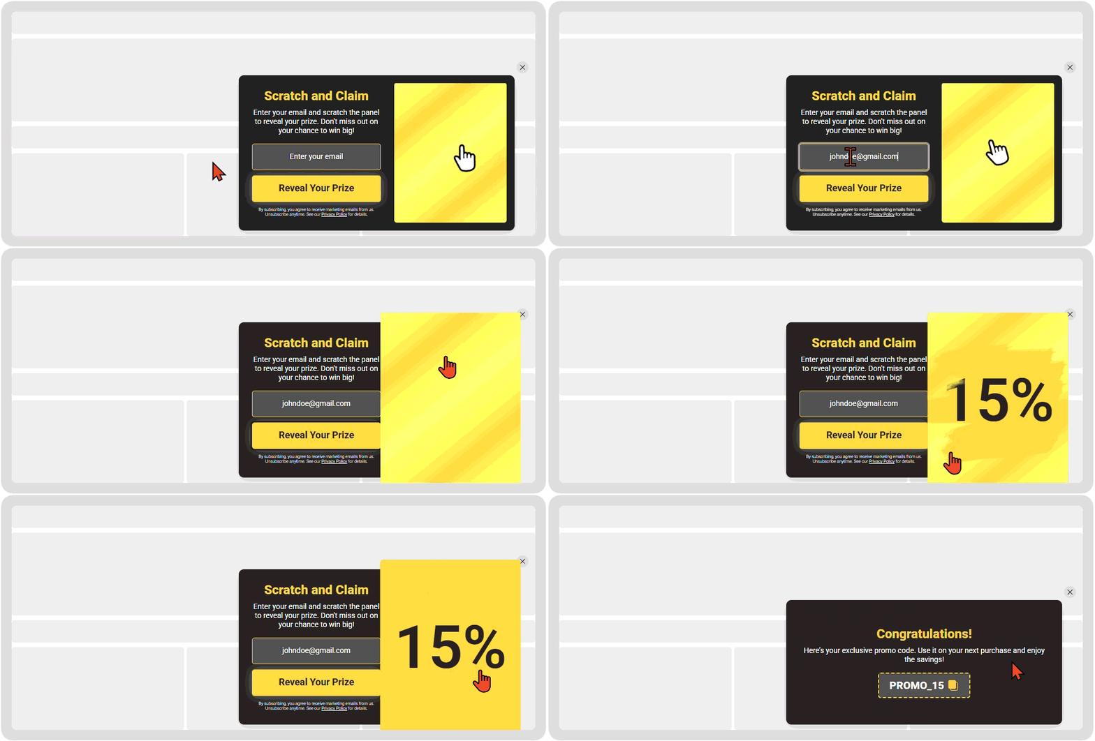
Best for: Mobile users. It’s tactile, compact, and feels natural on a touchscreen.
Slot machine
High energy for fast-moving traffic. The mechanics of matching symbols keep eyes locked on the screen during the reveal.
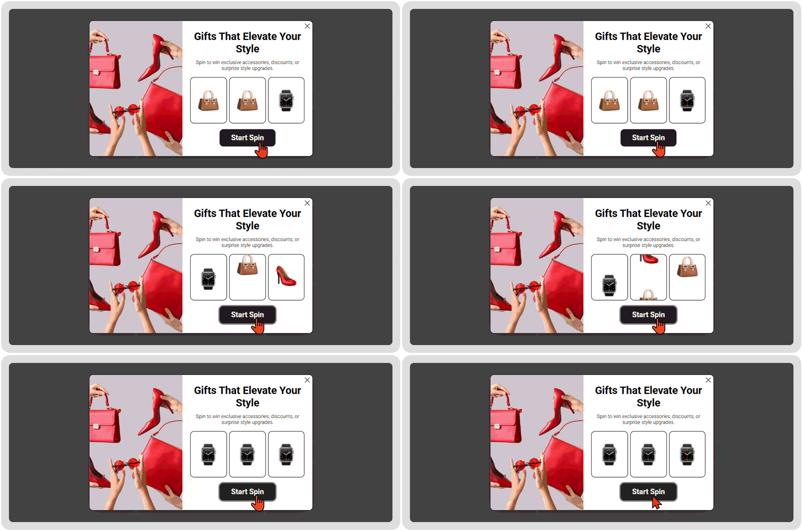
Best for: Flash sales where you need to move users to the cart in under 10 seconds.
Memory cards
Based on the “IKEA Effect,” users value a reward more if they “worked” for it. This requires cognitive investment rather than just luck.
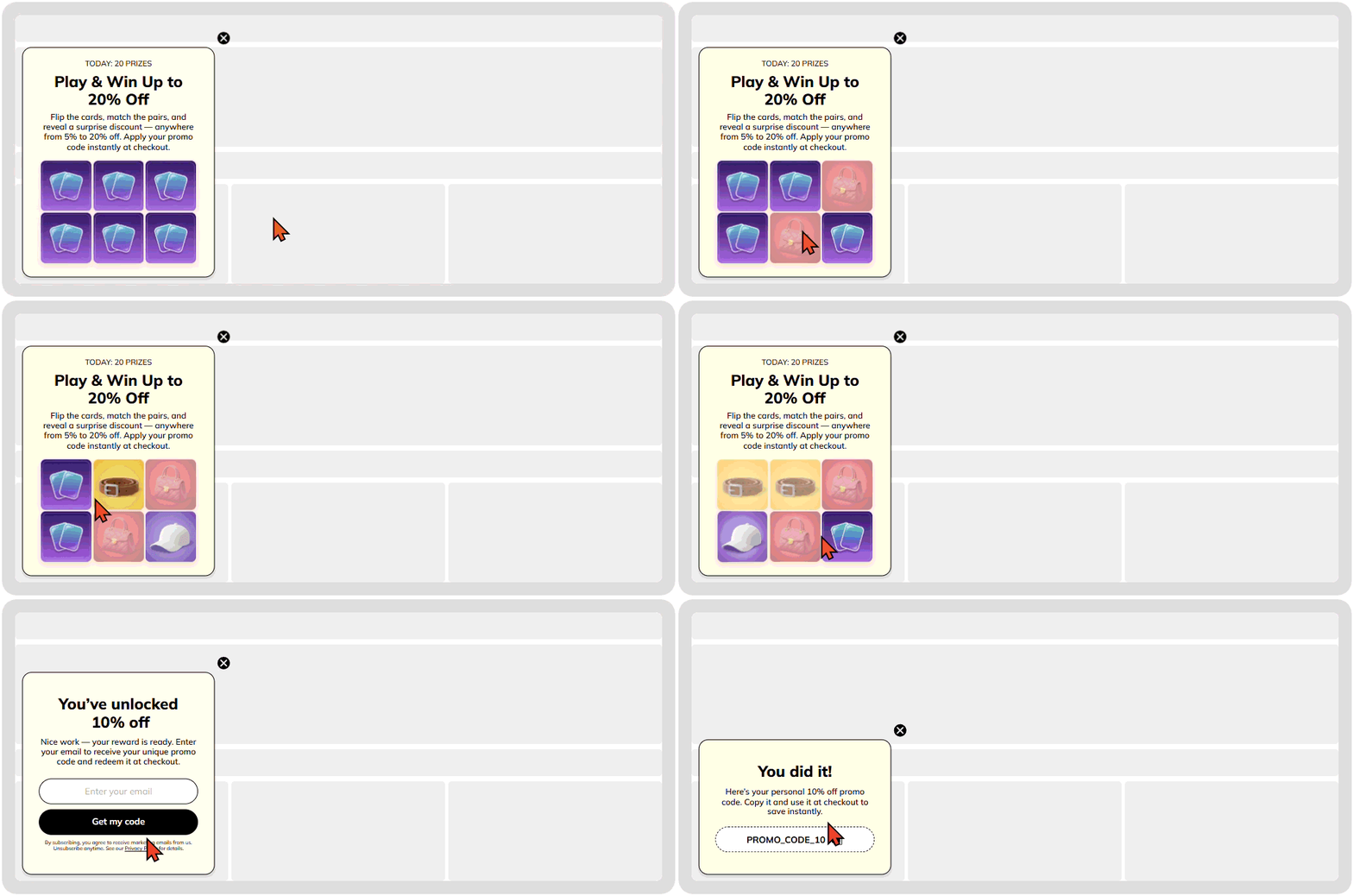
Best for: Returning visitors and high-ticket items. It breaks the autopilot mode of users who are used to seeing standard website popup windows.
Pick a gift
When a visitor selects a specific box, they feel personal agency. The prize is a choice they made, so they cherish it more, and, as a result, are more likely to use it.
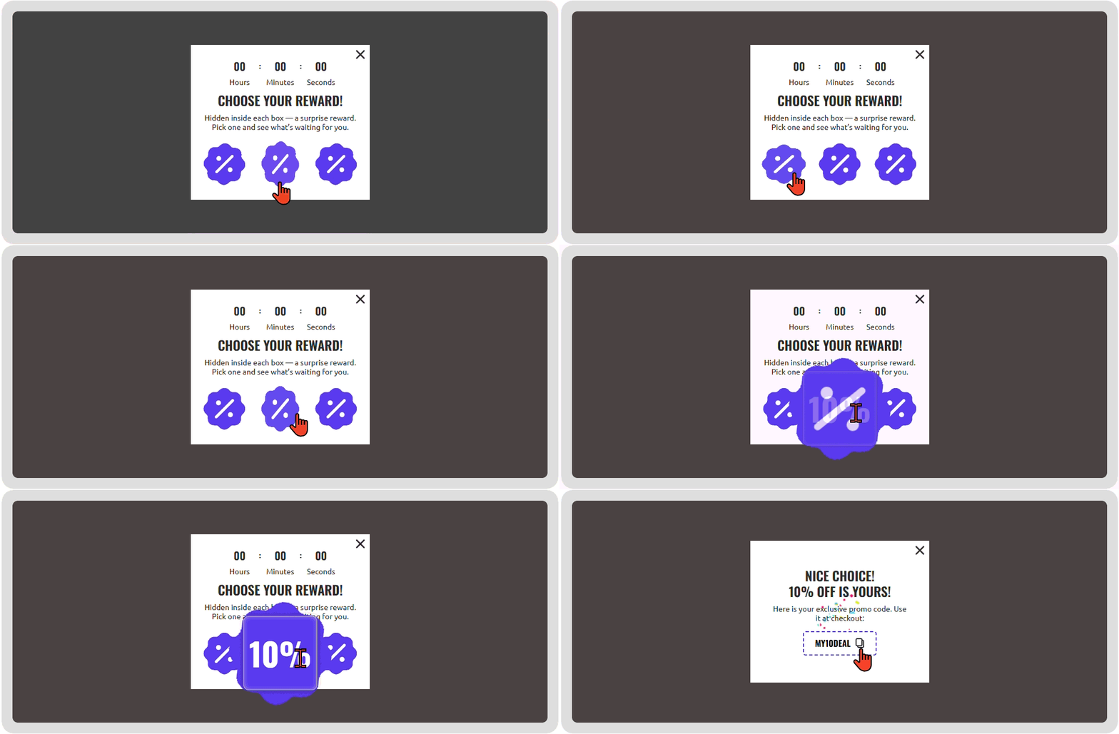
Best for: Cart recovery. The “I picked this” effect makes it much harder to walk away from the coupon at checkout.
Treasure hunt
A mini-quest where users have a set number of chances to find a prize on a grid. Every missed click increases the tension and the perceived value of the final reward.
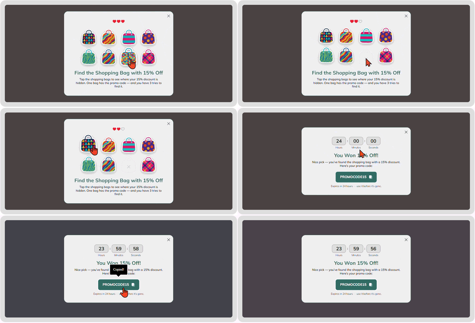
Best for: New collection launches where you want users to stay on the page longer.
Interactive quizzes
On a website without cookies, quizzes are your best tool for collecting zero-party data. Apart from the discount, you also add value with a personalized recommendation.
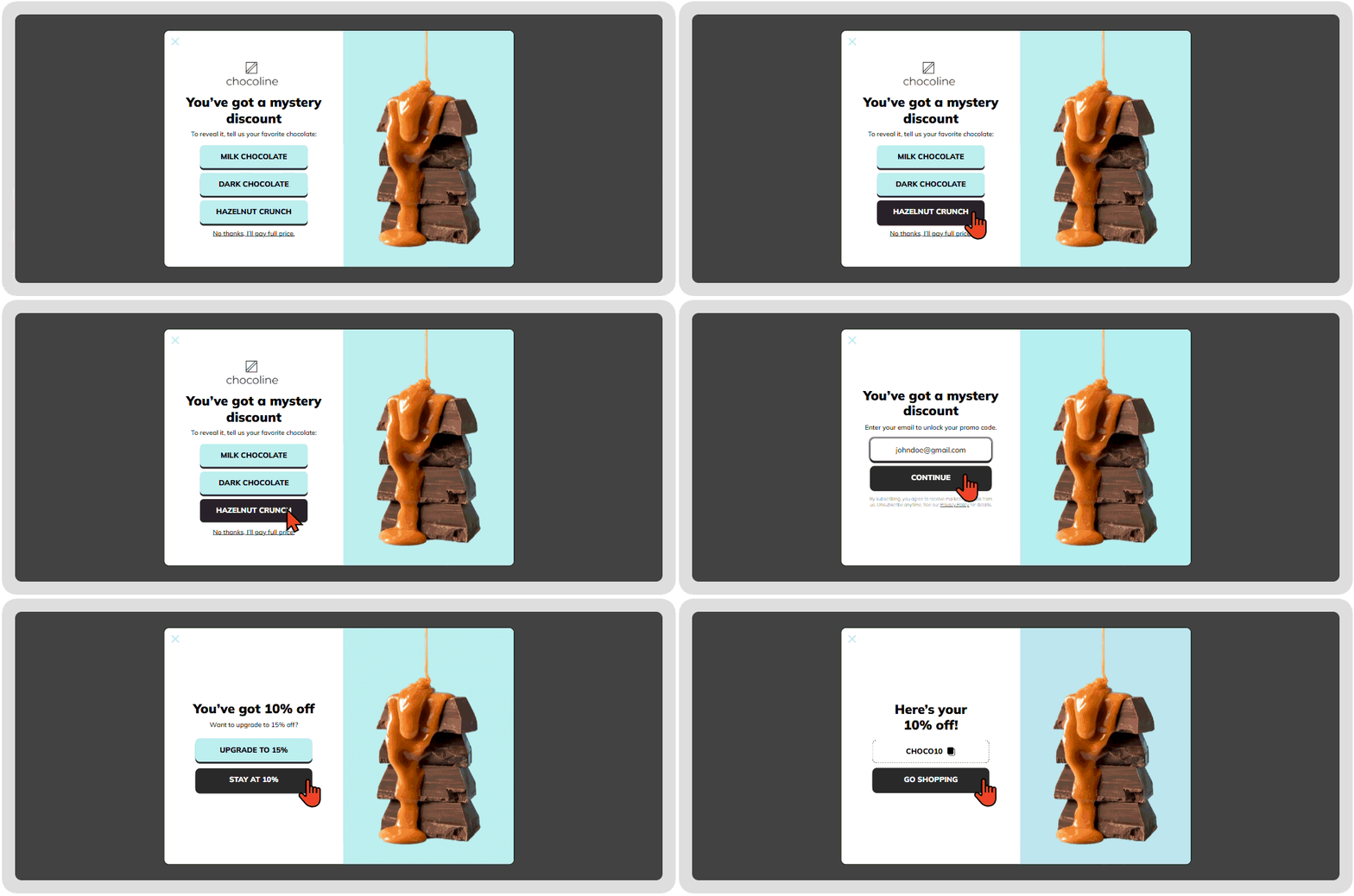
Best for: Complex products (skincare, tech) where users feel overwhelmed by choice.
Seasonal boosters (Shake the tree / Break the egg)
Aligns perfectly with the user's current vibe during holidays like Christmas or Easter.
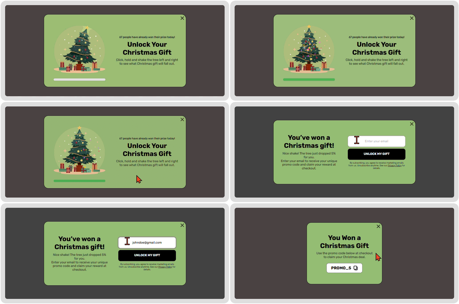
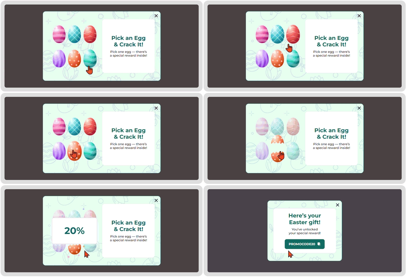
Best for: Standing out from the standard discount noise during peak seasons.
The goal-to-game strategic matrix | |||
Business goal | Best mechanic | Psychological trigger | 2026 Benchmark |
Max lead volume | Spin-the-Wheel | Anticipation and risk | 9.25% CR |
Mobile conversions | Scratch Card | The curiosity gap | 11.29% CR |
High-intent sales | Pick a Gift | Ownership | 7.26% CR |
SaaS/Trust | Interactive Quiz | Personalization/Authority | 5.28% CR |
Dwell time | Memory Cards | Cognitive investment | 26% CTR |
Instant action | Slot Machine | The “Jackpot” effect | 9% CTR |
Brand discovery | Treasure Hunt | The thrill of the search | 18% CTR |
Seasonal peaks | Shake the Tree/Break the Egg | Festive context | +15% engagement |
4. Website popup examples with advanced display logic
A great design fails if the timing is wrong. Use these Claspo triggering strategies to match your template to the user’s intent:
Exit-intent & Cart recovery
Target benchmark: 10-15% avg CR / 9-20% avg CR.
Why it works: It helps retain visitors who would otherwise be lost and improves bounce rates.
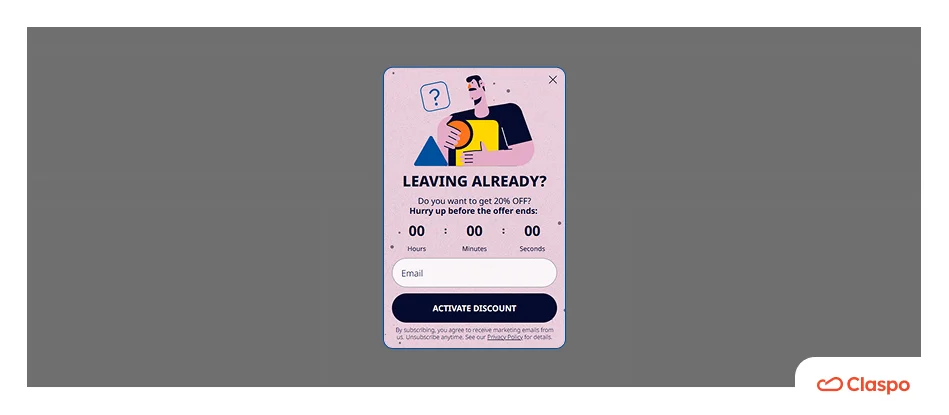
We have discussed how you can implement exit-intent popups to reduce cart abandonment. However, there is more than one way to use them. sales funnel conversion
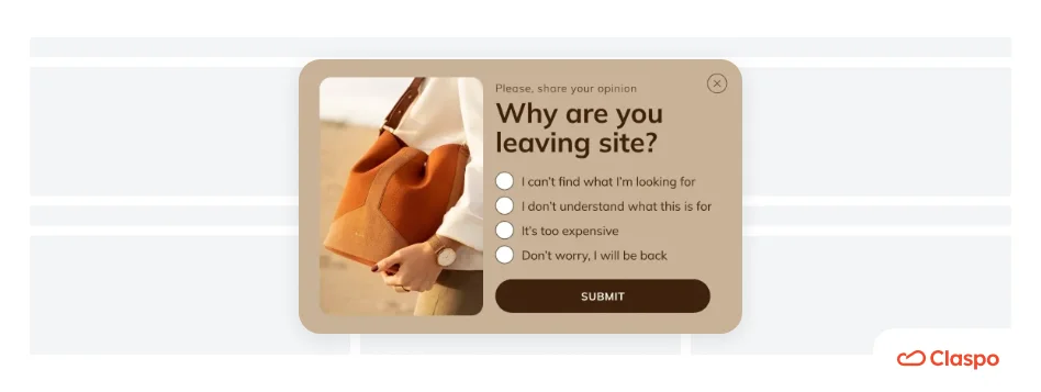
Use an exit-intent survey to ask why they are leaving. This can help adjust your SEO efforts or site design, which can positively affect sales in the long run.
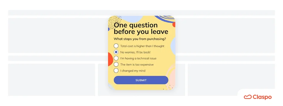
You can also ask why people don’t want to purchase from you. Is it shipping costs? Offer a free shipping code in the next step. Our data shows this can recover up to 20% of lost revenue.
Scroll-triggered engagement
Target benchmark: 4-6% CR baseline.
Why it works: These popups appear only when a user is genuinely interested in you.
These types of web popups will show up whenever a user has scrolled down a certain percentage of a webpage. They are a good tactic since they interact with the users who have shown interest in the website’s content but haven’t converted yet.
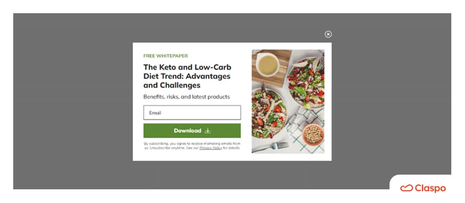
Trigger an ebook offer when a user reaches 50% scroll depth on a blog post. They’ve proven they value your content — now they are ready to subscribe.
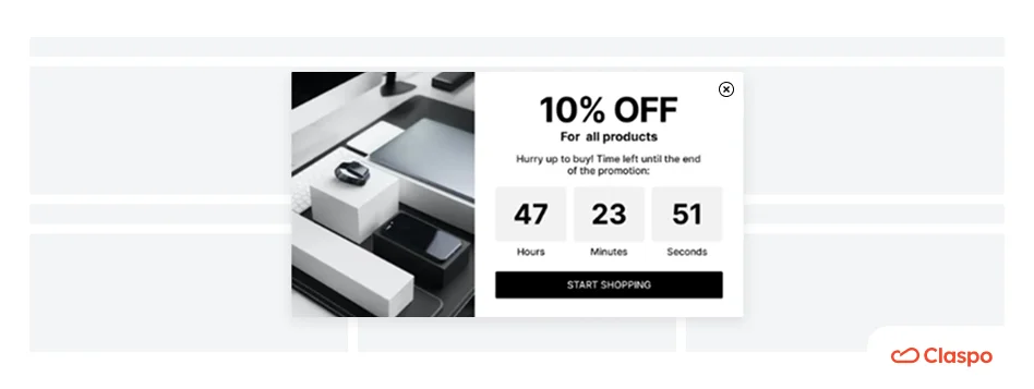
When creating a popup on your site for your product pages, use a limited-time discount popup after a user has scrolled down 60-70% of the page.
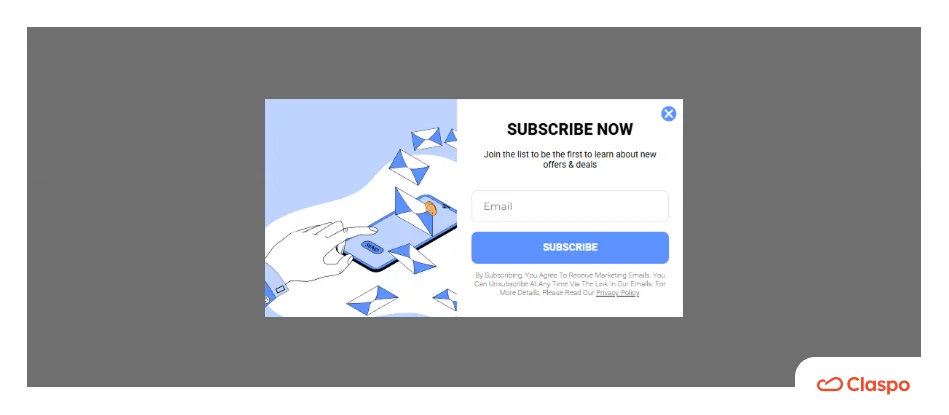
When working with heavy content pages, set a triggered web popup that asks to sign up for a newsletter form after reaching a particular point on the page.
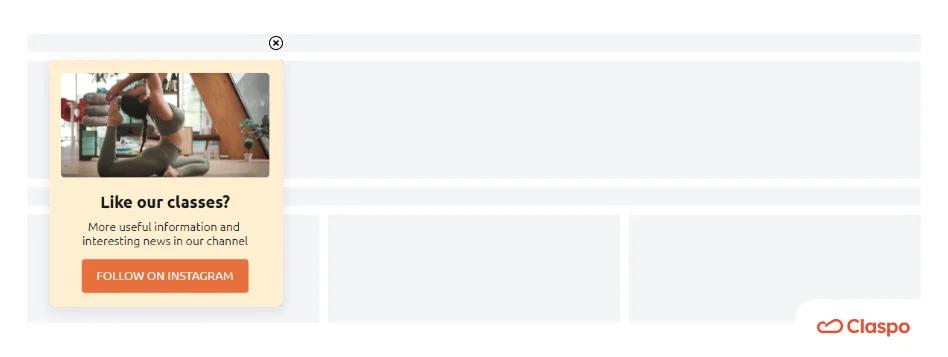
You can offer membership to a loyalty program or become part of the community after users show interest by scrolling through articles or product descriptions.
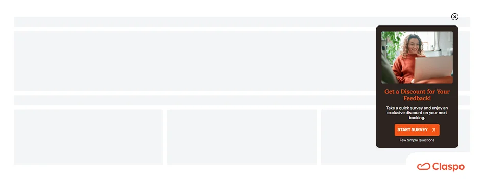
Lastly, consider using a scroll-triggered web popup asking your users whether they have received value from reading the entire content of your page.
Time-delayed website popup examples
Why it works: It gives the user time to settle in.
Web popups have a bad rep mainly because users are bombarded with different messages and windows right when they enter the website. Time-delayed website popups do the exact opposite. They show up when users have spent a pre-defined time period on the page.
In the Claspo editor, the default setting is 20 seconds. Don't bombard new visitors; let them browse your catalog first, then offer a “Welcome Gift” once they’ve shown intent.
Here are some ideas for time-delayed popups banners on websites:
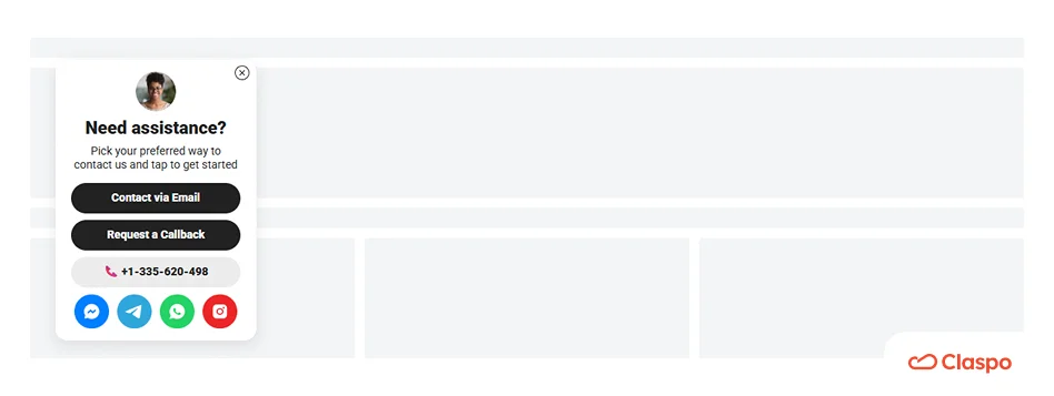
On product pages, you can set a delay and offer support or a demo to target users who might have questions. exit-intent popups on mobile
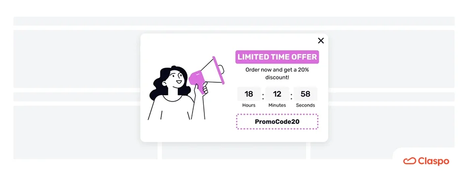
In the same way, display discount popups on your product or category pages. Allow the visitors to browse through your collection, and once they are done, offer them a discount to complete a purchase.
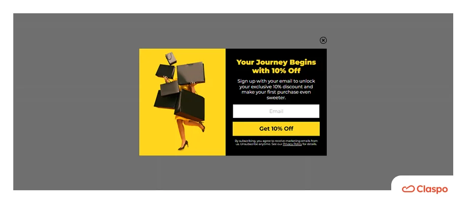
You can also target new visitors and offer them a welcome gift.
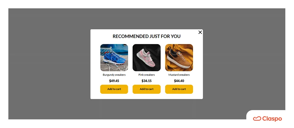
And, of course, you can use this type of web popup to build a newsletter subscriber list, promote your ebooks and events, or recommend related products.
Personalization via geo-location
Target benchmark: 5-7% CR.
Why it works: Relevance is the greatest motivator for conversion.
People usually appreciate personalized content, and thus, showing website popups based on a visitor’s geographic location allows you to offer region-specific information, deals, or content, making your messages more relevant.
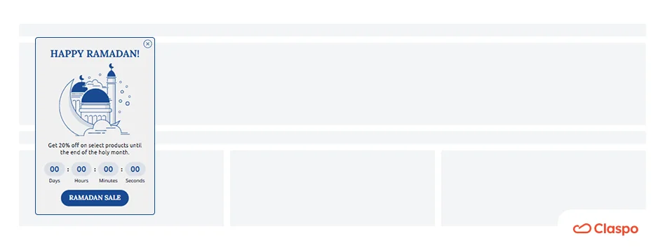
Claspo allows web popups to be displayed in the visitor's local language automatically. By offering holiday discounts during regional festivals like Diwali and Ramadan, you can immediately establish local authority.
Our template library has website popup examples for many occasions. Be it Rosh Hashanah, Diwali, Hanukkah, or any other festive event! Respect the culture of your audience and celebrate along with them.
Click-triggered website popup examples
Target benchmark: 12-15% CR.
As per the definition, these website popups will appear only once the user clicks on the specified element. Since it happens due to clear intent from their side, they convert 3 times faster than regular website popups. They feel integrated and respectful because the user is in total control.
The Teaser
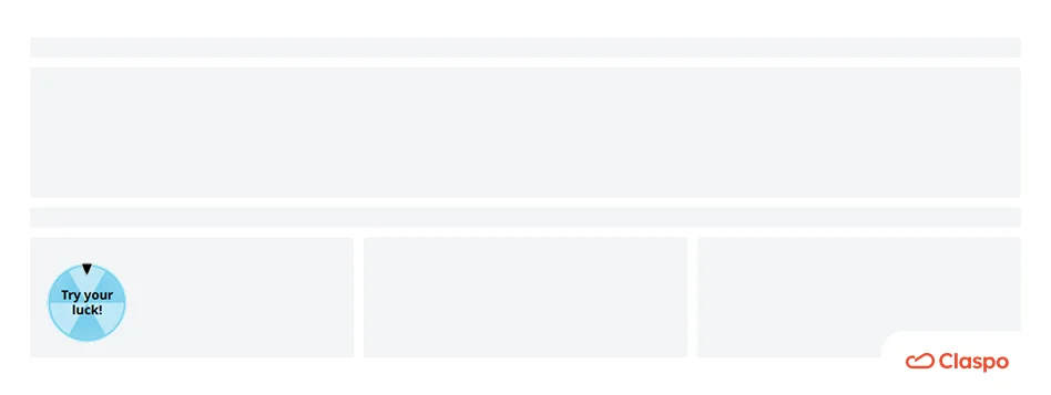
A small, non-intrusive button in the corner that comes with every website popup window. It acts as a preview of a popup — users click it only when they’re ready to accept your offer.
HTML triggers
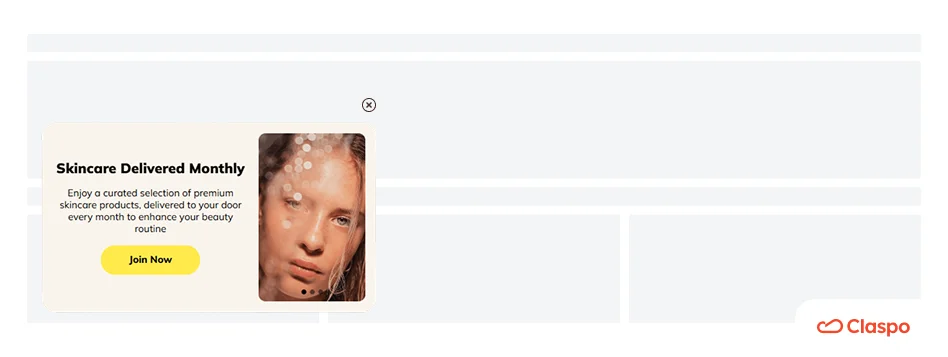
There’s also another way you can trigger website popups in Claspo — by clicking on any specific element, like a “Find my size” link or a product image. This is perfect for revealing specific offers, subscriptions, or detailed guides without cluttering the main page.
Campaign scheduled popups
Automation enables marketers to manage several campaigns in parallel without any additional effort. Timed popups make sure that their seasonal campaigns get maximum visibility.
You’ll find many website popup templates in our library tailored to celebrations and holidays. Let’s take this one, for example:
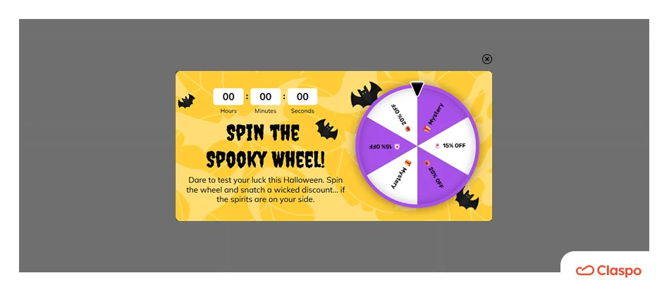
To schedule this popup for Halloween, create and save your popup. To do this, you need to click the calendar icon in the appearance settings of the popup editor.
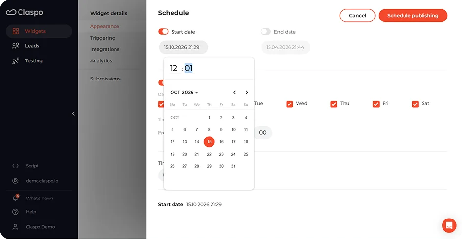
Thus, your "Early bird" offer will be finished, and your "Flash sale" will begin at an exact moment.
Website popup best practices: The anatomy of a high-converting popup
To reach the Top 10% of performers, you must treat your website popup as a sum of its parts. Each element — from the container to the trigger — has a measurable impact on your ROI. Below is the blueprint for a high-converting popup, mapped to the latest Claspo benchmarks.
1. The container (Layout & visual focus)
The container is the body of your message, and it dictates how much attention you want from the user. The right layout makes sure you get attention (CTR by up to 50%) without creating extra friction. Our benchmarks show that while centered popups are the kings of volume, built-in widgets are the masters of quality.
Layout | Best for | Performance | Placement | Why it works |
Centered popup | Mass lead gen, major sales, and games. | 10.6% CTR | Homepage (with delay) or Exit intent. | The industry standard for focus. |
Full-screen | Welcome offers, major sales, giveaways. | 6.61% CTR | Landing pages for new visitors. | Eliminates all distractions. |
Floating box | Subtle deals and content-driven nudges. | 7.49% CTR | Collection pages or blog. | Visible without blocking text. |
Floating bar | Site-wide alerts (Free shipping, announcements). | 5.13% CTR (+5-10% overall opt-in lift). | Header or Footer. | Non-intrusive "always-on" reminder. |
Built-in (Inline) | High-intent zones and editorial signups. | 4.9% CTR / 4.37% CR on high-intent ecom pages. | Checkout, “Thank You” screens, or mid-article. | Feels native, not like an ad. |
Teaser | Permission-based, user-driven engagement. | 12-15% CR | Bottom corner; works with any other popup. | Empowers the user; they click only when they are ready. |
Summing up:
For volume, stick to centered popups and full-screens (e.g., age verification popups). They have the highest visibility and immediate action.
For quality, focus on teasers and built-ins. While they get fewer impressions, their conversion rates (4.37% CR) show that users who opt in to see the message are far more likely to buy.
For continuity, use floating bars so that your visitors can always see global offers, such as free delivery.
2. The components (Structure & interaction)
The complexity of your form is the biggest predictor of friction. Based on 779 million impressions, the most successful popups prioritize interaction over data collection. Complexity here is a conversion killer.
Gamification vs. Static website popups
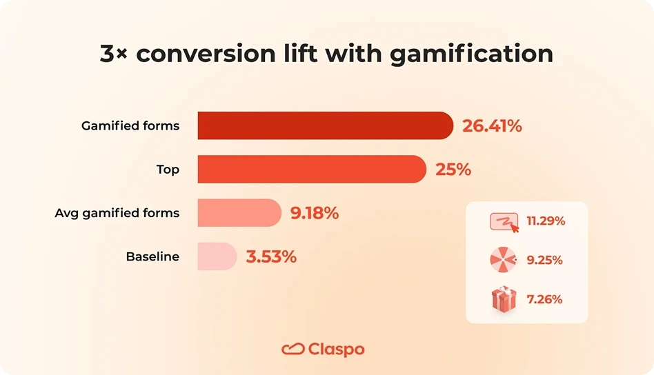
Interactive mechanics replace friction with curiosity.
Performance: Gamified forms average a 9.18% CR, while traditional static forms average 3.53%. The Top 25% of gamified popups reach an average 26.41% CR — nearly 8x higher than a standard form.
Mechanics: 76% of top performers use the Wheel of Fortune, while Scratch Cards lead in raw conversion efficiency at 11.29% CR.
Form complexity
Every extra field you add acts as a tax on your conversion rate.
The one-field rule: 95% of winning forms use only 1 or 2 fields.
Email-only: The baseline for friction-free signup (2.48% avg CR).
Email + Name: Adds a layer of personalization without significantly dropping conversion.
Adding a phone number field drops conversions sharply (0.44% avg CR). Reserve these for high-intent loyalty programs or post-signup steps.
Here are more of the web popup field combinations and their performance based on our benchmark data.
Field combination | Avr. CR |
Phone | 0.44% |
Email + Phone | 1.99% |
Email + Phone + Promo code | 2.10% |
Email + Preferences | 2.38% |
Email-only | 2.48% |
Email + Countdown timer | 2.56% |
Email + Promo code | 3.85% |
Don’t ask for a biography when you only need a handshake. The top 1% of performers win by offering a “micro-dopamine” hit (the game) in exchange for a “micro-commitment” (the email address).
Copy
Our study of the Top 10% reveals a clear formula for winning messaging: Benefit → Mechanic → Timing.
The clarity baseline: 100% of top promo popups use a friendly tone and clear value prop. 97.5% of high-performing SaaS popups skip the hype for professional, problem-solution framing.
Curiosity hooks: Curiosity drives the Media and Food sectors; 60% of top Food & Drinks popups use hooks like “Reveal your prize” to engage users before asking for data.
The urgency balance: Use timers only for real deadlines. Relative countdowns (e.g., “Your 15-minute window starts now”) give an excellent personal push.
Micro-copy: Use one headline for the Benefit, one sub-headline for the Condition, and an active 2-3 word CTA (e.g., "Get the Offer"). In Education, adding "Takes <1 minute" significantly reduces form-filling hesitation.
Don't... | Do... |
Use passive text like “Submit.” | Use active rewards like “Get My 10% Off.” |
Hide the conditions in fine print. | Use two short lines: one for the win, one for the rule. |
Use “stock” marketing speak. | Use a friendly, human, and brand-aligned tone. |
Visuals & Elements
In industries like Food & Drinks, every single top-performing popup uses high-contrast product photography to evoke “appetite appeal.”
3. The incentive
The incentive is the reason to click, the heart of the value exchange. Personalized offers provide a 20-40% conversion uplift. To hit the top 10% performance benchmarks, your reward must be clear and margin-safe.
The discount standard: 90% of top-performing popups rely on discounts.
The non-discount alternative: 10% of top performers use freebies (samples, guides, gifts). This is the best strategy for premium brands where discounting may devalue the product.
Display the reward instantly on the “Thank You” screen after signup. No need to make customers wait for emails to do further shopping.
4. The logic (Triggering & Targeting)
If you show a website popup too early, you lose the user. According to our 2026 data, applying behavioral triggers to your popups provides a 10-20% conversion uplift.
If your goal is... | Set trigger to... | 2026 Benchmark | Why it works |
New customer acquisition | 20-sec delay | 10-20% CR uplift | Allows visitors to settle in before offering the deal. |
Revenue recovery | Exit-intent | 5.76% CR (2x higher than avg) | Catches the bounce at the perfect moment |
Mobile sales lift | 30% Scroll | 11.29% CR (Scratch Card) | Doesn’t block the screen until the user shows active interest. |
Engaged reader capture | 50% Scroll | 3.70% CTR | Targets users who have already committed to your content. |
Scaling Ad traffic (Social) | 10-sec delay | 43.1% CTR (Promo) | Uses UTM targeting to bridge the ad with the page. |
5. Technical compliance
To meet the Top 10% standards, your popup should not only be good-looking but also well-engineered. Our data shows that top-performing brands prioritize these three hidden pillars of performance.
The 44x44 rule for mobile. Every interactive element, including the “Close” button and CTA, must be at least 44x44 pixels. This prevents “fat-finger” errors and keeps you compliant with modern accessibility standards.
Trust signals (Visible “X”). 85% of top popups use a clearly visible close button. Hiding the “X” is a “dark pattern” that increases bounce rates and risks Google Interstitial penalties. Transparency is key to earning a user's email.
Annoyance safeguard. Claspo’s Annoyance Safeguard prevents popups from overlapping or firing website popups too close together. This “breathing room” ensures users don’t instinctively close your offer when it pops up.
How to create a high-performing website popup
In order to transform your website popup window from just another one that is doomed to be dismissed into an actual CRO component, follow this simple five-step workflow.
Step 1. Define the goal and select a template
Start with a CRO-based template rather than a blank canvas. Choose your mechanic based on your KPIs and filter by use case (e.g., “Increase sales”) to ensure the popup layout is optimized against industry benchmarks.
Step 2. Customize the design
Your website popup must feel like a native extension of your brand to maintain trust. Use smart Themes in the Claspo editor or apply your brand palette to three main colors: accent, text, and background.
Step 3. Write action-oriented copy
Forget about generic “Sign Up” or “Submit” placeholder text. Use action-oriented messaging that moves the user closer to a reward. If you’re not a professional copywriter, use the Claspo AI agent. It will scan your site and rewrite headlines in your specific brand voice.
Step 4. Set smart display and targeting rules
Timing determines whether your web popup is a solution or an annoyance. Avoid “door-slamming” new visitors by setting a 20-second delay or a 30% scroll trigger, which typically leads to a 10-20% CR uplift.
Step 5. Sync, deploy, and run an A/B test
Connect your website popup to your marketing tools and make sure any new subscriber is automatically added to your welcome sequence. After, use built-in A/B testing to pit different mechanics against each other. Compare your results against our Top 10% benchmarks to see where you can further optimize your funnel.
Wrapping up
What a journey! We’ve explored numerous website popup form examples and dissected over 50 effective ways to use them. Now, it’s time to put all that knowledge to work.
Start experimenting with the templates mentioned in this guide, and launch your first popup. With Claspo, you can sign up for a free 14-day Pro trial, use the templates, integrate your tools, and go live — all at no cost.
Don't wait to turn insights into action — your next high-converting popup is just a click away!
Start converting more visitors today. Get started in minutes and see results right after.